Boldr Expedition Eiger Watch Lit Up My Week

I’d been keen to go hands-on with the Boldr Expedition ever since I saw it launch on Kickstarter. I vacillated on whether or not to back it at the time, but with many options to choose from at the time, I let it slide. Having spent a few weeks with it as part of my daily rotation I can say this: I should have pulled the trigger the first time I thought about doing so.
I’ve noticed I’m starting to sound like a broken record when it comes to these microbrand watches. Normally, I’ll start off by saying I didn’t expect much and then close on a positive note. Maybe I’ve become skeptical in my old age. Or maybe I’m just realistic. Having worked on all sides of production, I know how hard it is to create something vaguely interesting at a competitive price. But when it came to the Boldr Expedition, I had unusually high expectations. For once, those expectations were met, but not in the way I’d imagined they would be.
I’d envisaged a vanilla response to a product that had piqued my interest with its unusual shape. It would be fair to say that I thought it would be “okay” and nothing more. While I was certainly attracted to its silhouette, the fully luminous dial of the Eiger model I selected for review, and the twin crowns, there were, from the very first moment, some elements that gave me cause for concern. However, those concerns proved unfounded. And here’s why…
Dial
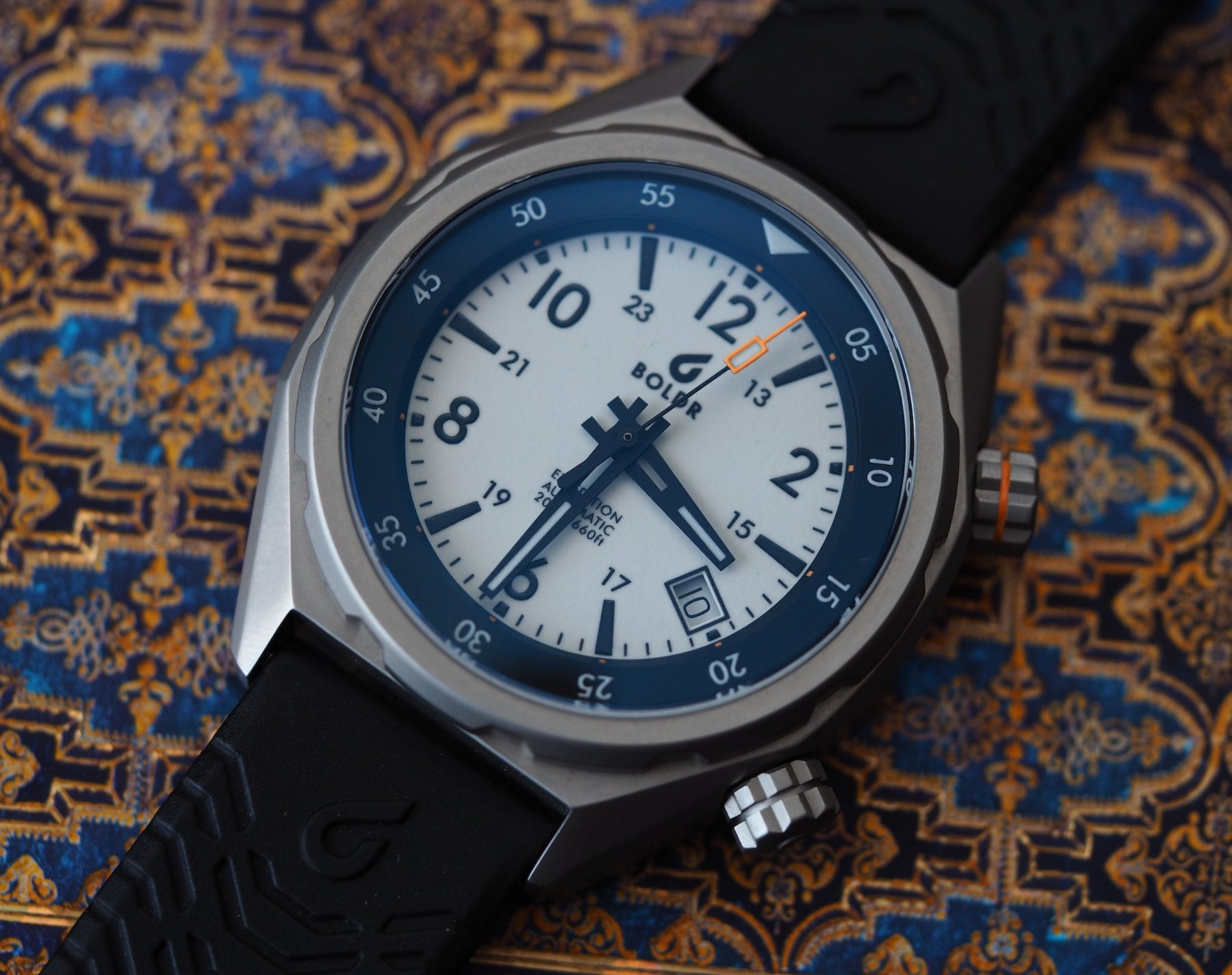
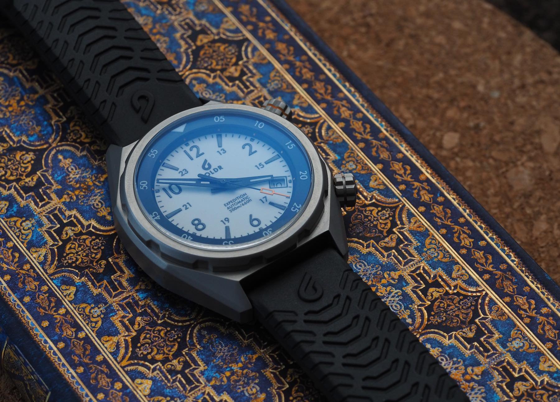
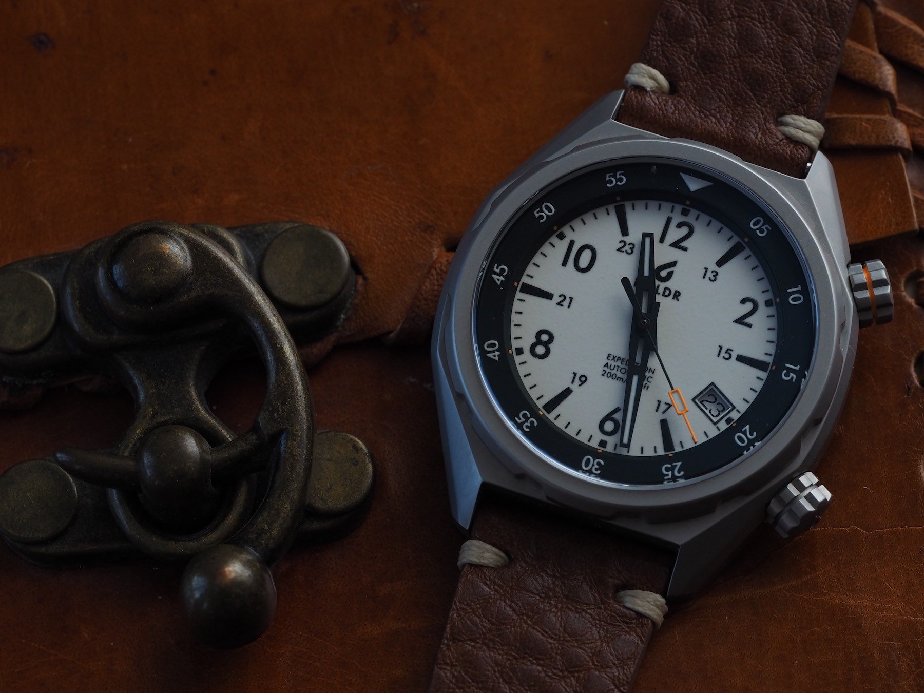
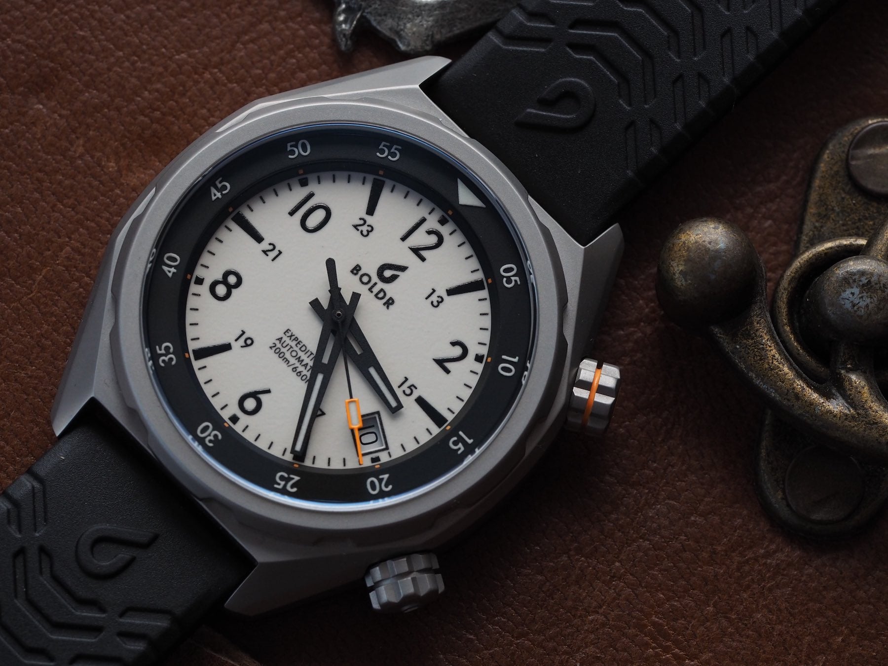
The Expedition series offers five dial options. I chose to review the Eiger. It is the only one that uses different colors for the dial and bezel. The other four options have luminous hour markers, but the Eiger goes for a fully lumed dial. The layout itself is nothing to write home about. There are no unexpected embellishments or unexpected elements. As such, I had been fearful that the dials would look dull in real life, but the surprisingly small diameter of this piece (measuring a compact 41mm across) means that the dials come off pleasingly uncluttered and perfectly proportioned.
Crucially, nothing about this affordable watch seems cheap.
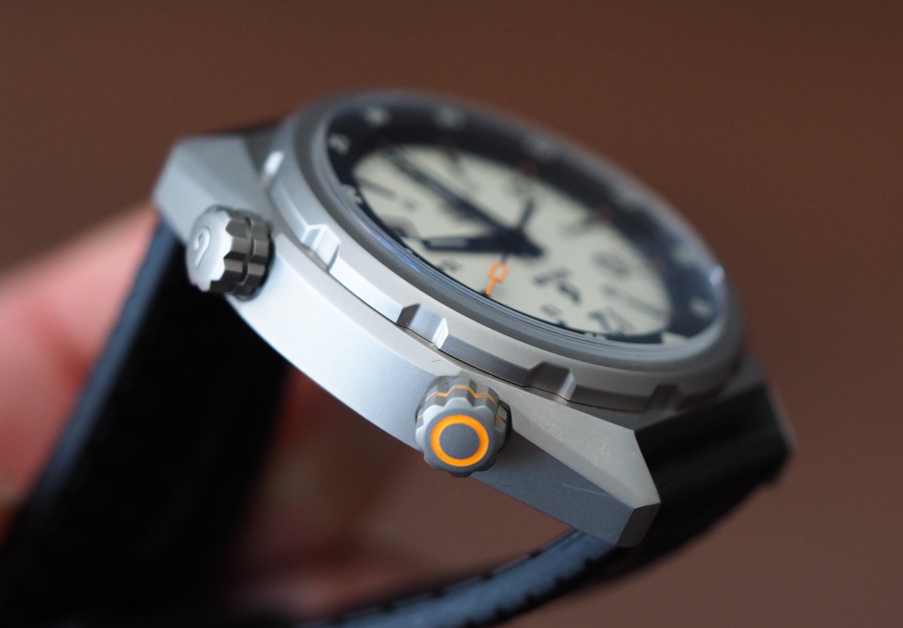
In fact, this smaller-than-expected diameter has a lot to do with why I like this watch so much. Rather than coming across as pared-back or sparse, the case proportions marry expertly with a dial set-up of remarkable depth and nuance. The inner rotating bezel (operated by the screw-down crown at 2 o’clock) feels secure in its rotation. The printed top level of the bezel sits on top of a chamfered chapter ring that slopes down to meet the dial. These two components are separated by a small gap, that gives this display a welcome sense of over-construction. Crucially, nothing about this affordable watch seems cheap.
Those crowns
Talking of cheap, I was worried those crowns would be sub-par. On press photos, the orange stripe on the 2 o’clock crown did not look appealing. In real life, however, it is neatly applied and looks about as flawless as this kind of exterior flourish can. The lovely, raised “B” logo on the time crown at 4 o’clock is well-executed.
Case size
I’ve mentioned the 41mm diameter. While that doesn’t sound incredibly small, the 14mm thickness plays a trick on your eyes. I can’t get away from the word “compact”. It is, in my opinion, the perfect word to describe this watch. While 14mm may sound stout on paper, the watch wears really small. It is, without a doubt, the thing I like most about this watch. Had this design been realized in 43mm, this comfort would have instantly evaporated. The 2 and 4 o’clock crowns further reduce the visual impact of the watch on the wrist.
The finish and shape
Now, if you hate uniform, media-blasted surface finishes, you won’t enjoy this case. For me, however, Boldr could not have chosen a better route for the Expedition series. As tool watches, this (very) gray exterior is ideal. We see a little bit of polish on the case back, but I’ll get to that momentarily.
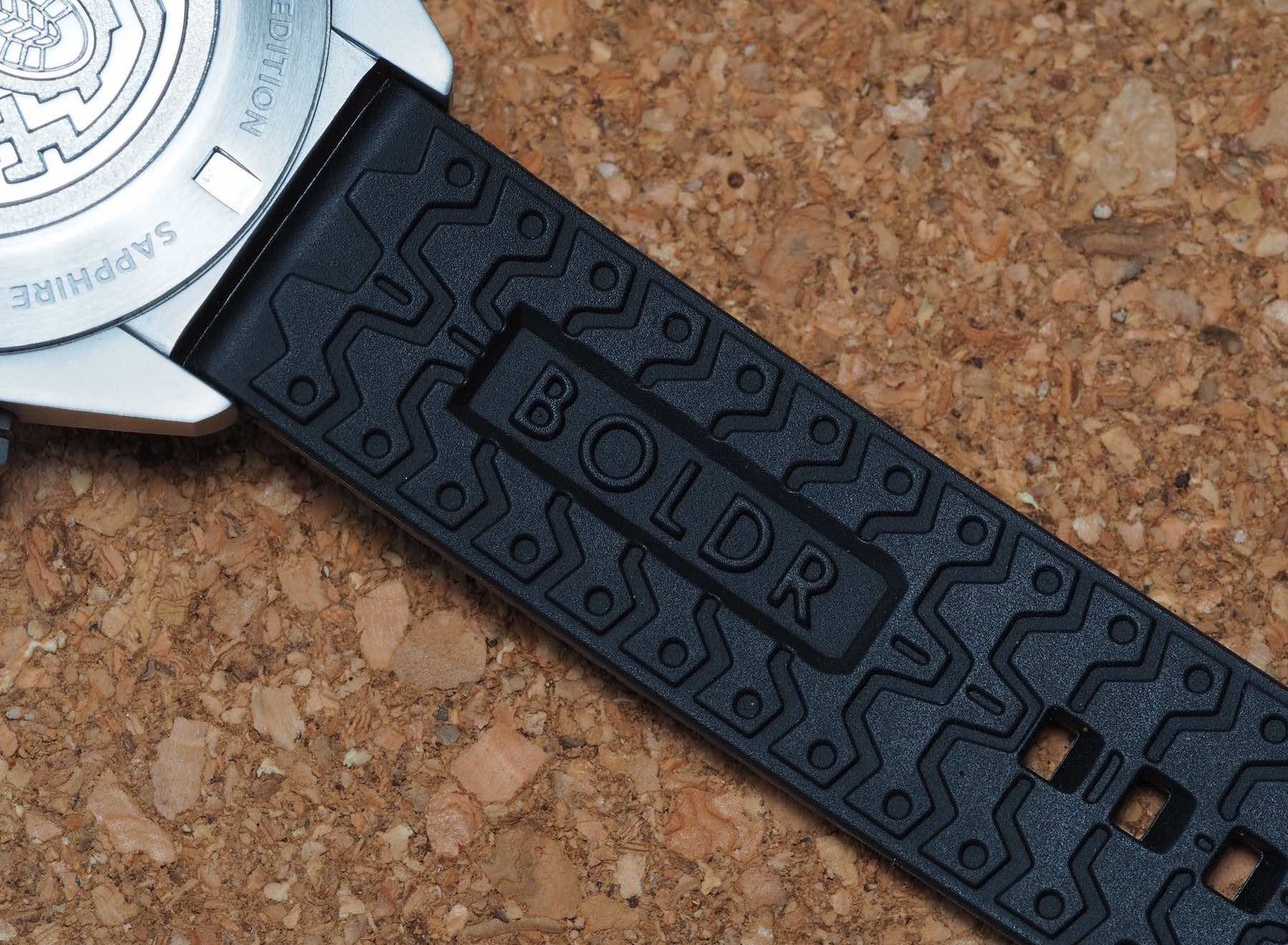
I love rubber straps but I did not love the one that came on this watch.
First, I want to draw attention to the shape of the case. Yes, I’m banging the same drum once again. The wearability of this watch is excellent. Why? Those basically-non-existent lugs add very little bulk to the silhouette. The straight spring bars, which rub up against flat surfaces of the case at 12 and 6 o’clock make flipping this thing onto other straps a dream. So much so, I did exactly that. I love rubber straps but I did not love the one that came on this watch. The buckle was decent, but the EPDM rubber is a real dust magnet. I also found the design a bit much. I stuck this model on a retro-styled brown leather strap from Nero Biglia and it came to life.
I’d encourage you to experiment…
Originally, if memory serves, these watches came on a kind of canvas strap with metal eyelets on the straps. A canvas option is still available in the shop for just 39 bucks. I liked those more but I really cannot recommend enough the look of this thing on a good quality tan leather strap. As a bit of a stickler for keeping watches on their original straps, this surprised me. I recently did the same with my Breitling Aerospace with great results. I guess my stance on design fidelity is waning as I further increase my wearing rotation. I’d encourage you to experiment as a result.
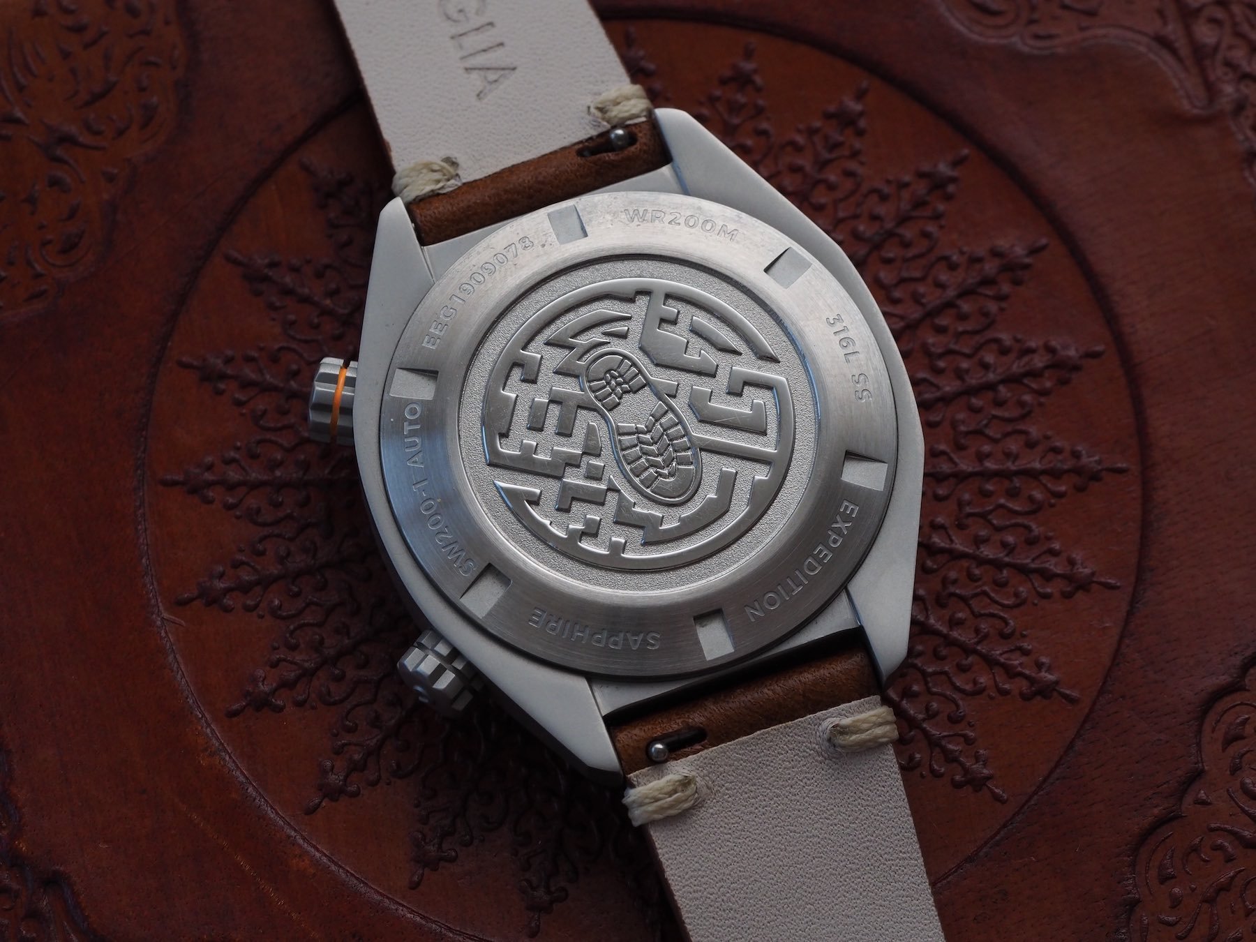
Naff but nicely executed case back
I’m a big fan of well-done case backs. I like a closed case back with a good design. What I like even more, is a good design expertly executed. Here we have the latter without the former. The quality of the case back is really top-drawer, but the design… Well, in my opinion, it’s a bit naff. I would much rather have seen a mountain range, or crossed pick-axes, or something more artful.
It’s too good to leave untouched.
Even as a dedicated outdoorsman rarely far from his walking boots, the footprint motif did not land with me. A small but heartfelt criticism that in no way detracted from my enjoyment of this watch. It is just something I would like Boldr to improve on next time the expedition gets an update. And that’s is something the brand should really consider. Not because it “needs” it, but rather because it deserves it. It’s too good to leave untouched.
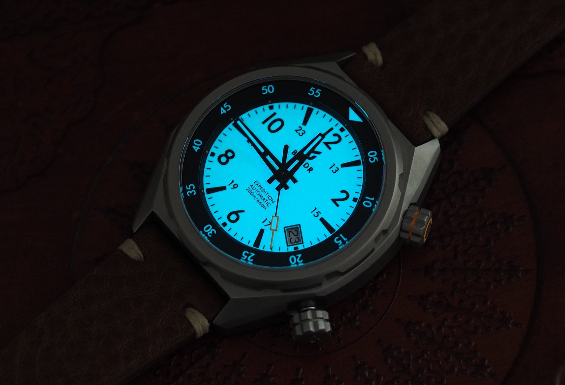
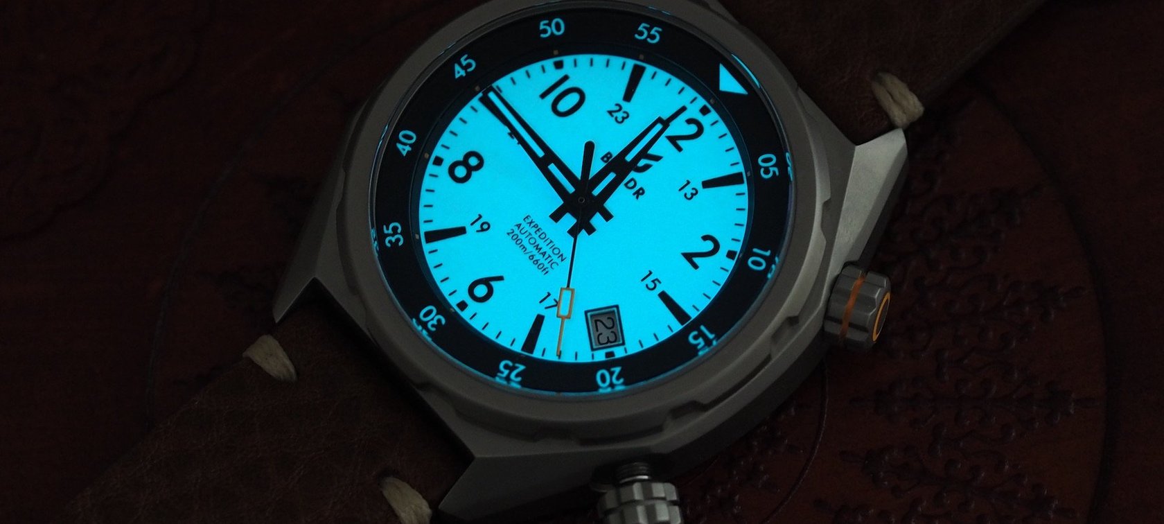
Excellent lume
So, the big question: How good is all that lume? Conjuring thoughts of ten-buck-Timexes, the Boldr Expedition Eiger had me worried. Could a brand charging around €500 for a watch of such character really have spent enough on the dial to pull it off? See above for the answer. Top stuff. I am really impressed. So impressed, in fact, that I spent ten minutes on my hands and knees in the toilet of my office (the only room dark enough for this shot in the middle of the day) to prove it to you.
I haven’t been so acquainted with a bathroom floor since the time I passed out in Frankie & Bennies…
This image has not been edited and was shot using a three-second exposure (just so you know there’s no trickery at play here). The fact I spent a few minutes scrabbling around on a (public) bathroom floor for this watch goes to show how much getting a good shot of the lume in action meant to me. I haven’t been so acquainted with a bathroom floor since the time I passed out in Frankie & Bennies after inhaling a pitcher of lager and a double burger. I managed to suppress those harrowing memories for your benefit. And you’re more than welcome.
Is hand lume necessary?
One weird point raised, however, has to be the lume on the hands. I mean, is it at all necessary with a fully lumed dial? For the sake of display homogeny in low-light conditions, I would say not. I’m pretty sure Boldr left the lume on these hands so they could share them with the Matterhorn model. The seconds hand with the orange tip, meanwhile, seems the same as the Sinai/Everest/Rushmore editions. That’s a smart enough cost-motivated decision, but if the Expedition Eiger II ever hits the shelves, I want to see skeletonized hands to make the most of that glorious dial.
Conclusion
Well, it is broadly positive. The watch case is superb. I love the dial. The crowns are well executed and a joy to use. The case back execution is great but the design lackluster. I’d definitely swerve the standard strap for now, but do lament that the buckle is too wide for tapered alternatives. The case provides the Sellita SW200-1 with 20,000A/m of magnetic resistance. The lug-to-lug length is just 46mm and the watch takes 20mm straps (the buckle is the same width). And the price for the Boldr Expedition Eiger? $599. Learn more about Boldr Supply co. here.
Follow me on Instagram @robnudds